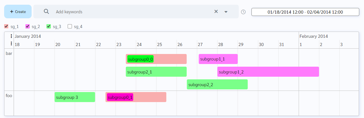
How does this component appear in a web page?
Animation
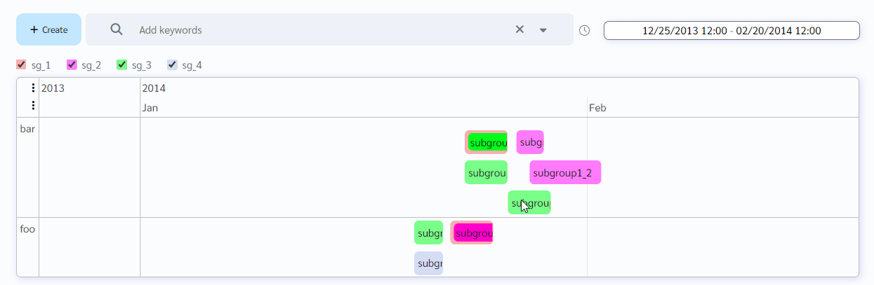
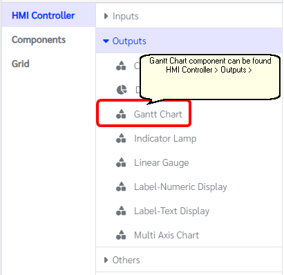
How does this component appears in Aimagin Connect?
What can be configured?
Parameters
Configuration Parameter |
Selectable Option/Value |
Description |
Default Value |
Data type |
Items■■ |
|
Items shown in the gantt chart |
|
|
Groups■■ |
|
Groups shown in the gantt chart |
|
|
Options■■ |
|
Options can be used to customize the timeline Note: few options like Editable and Orientation will be not available in this version |
|
|
Sub-group colors■■ |
|
User can specify subgroups for specific items and this parameter would be helping to categorized it with different colors |
|
|
Selected■■ |
|
Users can get/set selected item id(s) from this parameter |
|
Array Object |
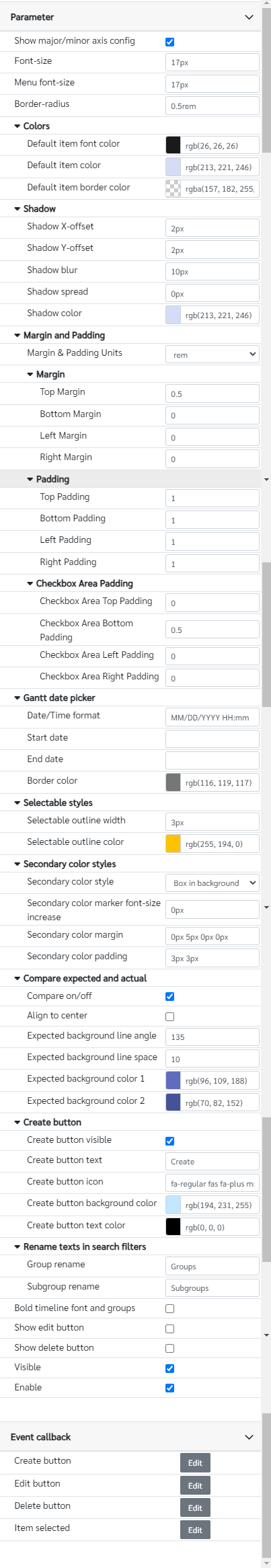
Show major/minor axis config■ |
true--false |
User can configure the axis on live preview while this parameter is turn on. Two buttons will be displayed to config the axes |
true |
Boolean |
Font-size■■ |
|
Font size of the entire graph. note this parameter need to have units |
17px |
String |
Menu font-size■■ |
|
Changes only the font size of the menu. note this parameter need to have units |
17px |
String |
Border-radius■ |
|
Border radius of the graph and items |
0.5rem |
String |
Default item font color■ |
|
Default item font color when it is not specified in the items |
rgb(26 26 26) |
Color |
Default item color■ |
|
Default item color when it is not specified in the items and sub groups |
rgb(213 221 246) |
Color |
Default item border color■ |
|
Default item border color when it is not specified in the items |
rgb(151 176 248) |
Color |
Shadow X-offset■■ |
|
Gantt chart shadow x-offset |
2px |
String |
Shadow Y-offset■■ |
|
Gantt chart shadow y-offset |
2px |
String |
Shadow blur■■ |
|
Gantt chart shadow blur |
10px |
String |
Shadow spread■■ |
|
Gantt chart shadow spread |
0px |
String |
Shadow color■■ |
|
Gantt chart shadow color |
rgb(213 221 246) |
Color |
Margin and padding Units |
px--cm--mm--in--pc--pt--ch--em--rem--vh--vw--vmin--vmax |
Margin & padding units options for the component |
rem |
String |
Top Margin■■ |
|
Top margin of the component |
0.5 |
Number (in selected unit) |
Bottom Margin■■ |
|
Bottom margin of the component |
0 |
Number (in selected unit) |
Left Margin■■ |
|
Left margin of the component |
0 |
Number (in selected unit) |
Right Margin■■ |
|
Right margin of the component |
0 |
Number (in selected unit) |
Top Padding■■ |
|
Top padding of the component |
1 |
Number (in selected unit) |
Bottom Padding■■ |
|
Bottom padding of the component |
1 |
Number (in selected unit) |
Left Padding■■ |
|
Left padding of the component |
1 |
Number (in selected unit) |
Right Padding■■ |
|
Right padding of the component |
1 |
Number (in selected unit) |
Checkbox Area Top Padding■■ |
|
Top padding for the checkbox area |
0 |
Number (in selected unit) |
Checkbox Area Bottom Padding■■ |
|
Bottom padding for the checkbox area |
0.5 |
Number (in selected unit) |
Checkbox Area Left Padding■■ |
|
Left padding for the checkbox area |
0 |
Number (in selected unit) |
Checkbox Area Right Padding■■ |
|
Right padding for the checkbox area |
0.5 |
Number (in selected unit) |
Date/Time format |
|
Date time format to show on the date range picker in the Gantt chart |
MM/DD/YYYY hh:mm |
String |
Start date■■ |
|
The initial start date for the axis of the timeline. Note this should match with the Date/Time format |
|
String |
End date■■ |
|
The initial end date for the axis of the timeline. Note this should match with the Date/Time format |
|
String |
Border color■■ |
|
Date range picker border color |
rgb(116, 119, 117) |
Color |
Selectable outline width |
|
Outline width for selected items, note this parameter need to have units |
3px |
String |
Selectable outline color |
|
Outline color for selected items |
rgb(255 194 0) |
Color |
Secondary color style |
Marker in front--Box in background |
Style of showing the secondary color |
Box in background(Box) |
String |
Secondary color marker font-size increase |
|
Increase marker font-size by some value. Note that this would be added to the font size in the parameter |
0px |
String |
Secondary color margin |
|
Margins for the secondary color object |
0px 5px 0px 0px |
String |
Secondary color padding |
|
Paddings for the secondary color object |
3px 3px |
String |
Compare on/off |
true--false |
Compare expected and actual |
true |
Boolean |
Align to center |
true--false |
Center align expected items with the actual items |
false |
Boolean |
Expected background line angle |
|
Expected background pattern to show on the gantt char |
135 |
Number |
Expected background line space |
|
Expected background line space in pixels |
10 |
Number |
Expected background color 1 |
|
Expected color 1 |
rgb(96, 109, 188) |
Color |
Expected background color 2 |
|
Expected color 2 |
rgb(70, 82, 152) |
Color |
Create button visible■■ |
true--false |
Show/Hide create button |
true |
Boolean |
Create button text■■ |
|
Create button text |
Create |
String |
Create button icon■■ |
|
Create button icon class |
fa-regular fas fa-plus mr-1 |
String |
Create button background color■■ |
|
Create button background color |
rgb(194, 231, 255) |
String |
Create button text color■■ |
|
Create button font color |
rgb(0,0,0) |
String |
Group rename■■ |
|
Rename data structure groups to show on the search filters |
Groups |
String |
Subgroup rename■■ |
|
Rename data structure subgroups to show on the search filters |
Subgroups |
String |
Bold timeline font and groups |
|
|
|
|
Show edit button■■ |
|
|
|
|
Show delete button■■ |
|
|
|
|
Visible■■ |
true--false |
Show hide editbox |
true |
Boolean |
Enable■■ |
true--false |
Enable disable editbox |
true |
Boolean |
■ - getParameter function available - getParameter function needs two input parameters, id and parameter name eg: getParameter('id of the component','parameter name')
■ - setParameter function available - setParameter function needs three input parameters, id, parameter name and the value eg: setParameter('id of the component','parameter name',value)
Items format
This format will be mainly similar to the Vis timeline library item data format. However, it is also consists of adding a secondary color to a item and the example data structure as follow,
[
{
id: 1,
content: 'subgroup0_0',
start: '2014-01-23T12:00:00',
end: '2014-01-26T12:00:00',
group: 'bar',
subgroup: 'sg_1',
secondary_color: 'rgb(0, 255, 28)',
},
{
id: 2,
content: 'subgroup0_1',
start: '2014-01-22T12:00:01',
end: '2014-01-25T12:00:00',
group: 'foo',
subgroup: 'sg_1',
secondary_color: 'rgb(255 0 203)',
}
]
If "Compare on/off" is on user can also add another parameter to the items which is compare. When the compare: "expected" is set to the item. special css format will be applied to the specific item.
Note that when "Compare on/off" is true, add these parameters to the Options
stack: false,
stackSubgroups: true,
Sub-group colors format
This accepts JSON array format and it required to specify the subgroup name and the color for it. If this has not specified it will automatically assign the default color that user has selected in the parameter list.
Accepting JSON array format would be like this
[
{subgroup: 'sg_1',color: "#eb4343"},
{subgroup: 'sg_2',color: "#ff7afc"},
{subgroup: 'sg_3',color: "#7ab1ff"}
];
Note that the subgroup name should be same as specified in the Groups parameter.
Event callback
Event callback |
Description |
Create button |
This callback will triggered when the create button is clicked |
Edit button |
This callback will triggered when the edit button is clicked. Note that the edit button will only shows when an item is selected |
Delete button |
This callback will triggered when the delete button is clicked. Note that the edit button will only shows when an item is selected |
Item selected |
This callback will execute when an item is selected from the gantt chart |
When to use this component?
This component can be used to show data on a timeline as a gantt chart. Can be categorized by groups and also categorized under sub categories as well.
How does this component work?
This component is based on the visjs timeline library and we have included modifications to the library to show/hide sub categories in the Gantt chart externally.