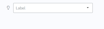
How does this component appear in a web page?
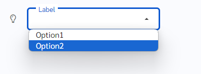
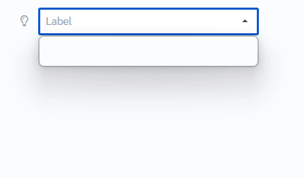
When the component is in focus(dropdown is clicked)
Animation
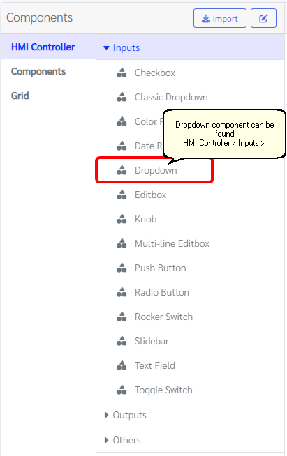
How does this component appears in Aimagin Connect?
What can be configured?
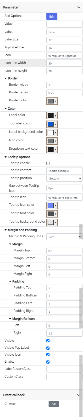
Parameters
Configuration Parameter |
Selectable Option/Value |
Description |
Default Value |
Data type |
Add Options■■ |
|
Options for dropdown to select |
[{'Text':'Option1','Value':'Value1'}, {'Text':'Option2','Value':'Value2'}] |
|
Text ■■ |
|
The text of the dropdown options |
|
|
Value■■ |
|
The Initial value of the dropdown should be added to the option list |
|
|
Label■■ |
|
Label text |
Label |
String |
LabelSize■■ |
|
Text size of the label |
17 |
Number |
TopLabelSize |
|
Label text size when the dropdown is in focus |
14 |
Number |
Icon■■ |
|
Fontawesome icon class |
fa-regular fa-lightbulb |
String |
Icon min width■■ |
|
Icon min width This may be useful to align more than one dropdowns together. Because all fontawesome icons do not have the same sizes. Therefore, giving min size will make it easy to align contents. |
20 |
Number (in pixels) |
Icon min height■■ |
|
Icon min height This may be useful to align more than one dropdowns together. Because all fontawesome icons do not have the same sizes. Therefore, giving min size will make it easy to align contents. |
20 |
Number (in pixels) |
Margin and padding |
px--cm--mm--in--pc--pt--ch--em--rem--vh--vw--vmin--vmax |
Margin & padding options for the component, icon and input field, allowing users to select units. |
rem |
|
Top Margin■■ |
|
Top margin of the component |
0.5 |
Number (in selected unit) |
Bottom Margin■■ |
|
Bottom margin of the component |
0 |
Number (in selected unit) |
Left Margin■■ |
|
Left margin of the component |
0 |
Number (in selected unit) |
Right Margin■■ |
|
Right margin of the component |
0 |
Number (in selected unit) |
Top Padding■■ |
|
Top padding of the component |
1 |
Number (in selected unit) |
Bottom Padding■■ |
|
Bottom padding of the component |
1 |
Number (in selected unit) |
Left Padding■■ |
|
Left padding of the component |
1 |
Number (in selected unit) |
Right Padding■■ |
|
Right padding of the component |
1 |
Number (in selected unit) |
Icon Left Margin■■ |
|
Left margin of the icon |
0 |
Number (in selected unit) |
Icon Right Margin■■ |
|
Right margin of the icon |
1.5 |
Number (in selected unit) |
Border width■■ |
|
Border width when it is not in focus, When it is in focus this will change to 3px |
1 |
Number (in pixels) |
Border radius■■ |
|
Border radius |
0.25 |
Number (in rem) |
Border color■■ |
|
Border color when it is not in focus mode |
rgb(116, 119, 117) |
Color |
Label color■■ |
|
Label text color when it is not in focus |
rgb(31, 31, 31) |
Color |
TopLabel color■■ |
|
Label text color when it is in focus. The same color will be applied to the border. |
rgb(11, 87, 208) |
Color |
Label background color■■ |
|
Label background color needs to match the background color of the dropdown |
rgb(255, 255, 255) |
Color |
Icon color |
|
Icon color |
rgb(116, 119, 117) |
Color |
Dropdown text color■■ |
|
Options text color |
rgb(31, 31, 31) |
Color |
Tooltip enable■■ |
|
Show tooltip |
true |
Boolean |
Tooltip content■■ |
|
tooltip text content |
Tooltip example |
String |
Tooltip position■■ |
Top--Bottom |
Tooltip appearing position |
Bottom |
String |
Gap between Tooltip icon■■ |
|
Gap between tooltip and the icon |
8px |
String |
Tooltip icon■■ |
|
Font awesome class names for the tooltip icon |
fa-regular fa-circle-info |
String |
Tooltip icon color■■ |
|
Tooltip icon color |
rgb(109, 133, 255) |
Color |
Tooltip font color■■ |
|
Tooltip font color |
rgb(81, 81, 81) |
Color |
Tooltip background color■■ |
|
Tooltip background color |
rgb(228, 228, 228) |
Color |
Visible■■ |
true--false |
Show hide dropdown |
true |
Boolean |
Visible Top Label ■■ |
true--false |
Show hide dropdown top label |
true |
Boolean |
Visible Icon ■■ |
true--false |
Show hide icon |
true |
Boolean |
Enable■■ |
true--false |
Enable disable dropdown |
true |
Boolean |
LabelCustomClass■ |
|
Any externally defined classes can be assigned to the label from here |
|
String |
CustomClass■ |
|
Any externally defined classes can be assigned to the input field from here |
|
String |
■ - getParameter function available - getParameter function needs two input parameters, id and parameter name eg: getParameter('id of the component','parameter name')
■ - setParameter function available - setParameter function needs three input parameters, id, parameter name and the value eg: setParameter('id of the component','parameter name',value)
Event callback
Event callback |
Description |
Change |
This callback will triggered if the dropdown field has a changed |
Add Options
The 'Add Options' parameter name can be used to add options to the dropdown using the 'setParameter' function. The value should be a JSON array with 'Text' and 'Value' keys.
eg: setParameter('id of the component','Add Options', [{'Text':'Option1','Value':'Value1'}, {'Text':'Option2','Value':'Value2'}])
If the values of the 'Value' key are not declared, the values of the 'Text' key will be assigned as the values of the 'Value' key.
eg: setParameter('id of the component','Add Options', [{'Text':'Option1'}, {'Text':'Option2'])
'Text' and 'Value', parameter names can be utilized to set or retrieve the text and value of dropdown options.
eg: setParameter('id of the component', 'Text', 'Option1'])
setParameter('id of the component', 'Value', 'Value1'])
When to use this component?
An alternative to the default dropdowns available in the Components>Forms section, this dropdown presents a versatile choice for users. It seamlessly integrates with web pages and offers advanced functionality, including animated labels that respond dynamically when the dropdown gains focus. This feature-rich component provides users with enhanced interaction capabilities, making it a valuable addition to any web form or application interface.
How does this component work?
This component functions similarly to a standard dropdown, with additional features such as animated label actions and a Font Awesome icon positioned on the left. By default, the component includes a callback for the input field to determine whether it is in focus. When the dropdown gains focus, the label smoothly moves upward, providing the user with the ability to select options from the dropdown list. This interactive design enhances user experience by combining standard dropdown functionality with animated label interactions.