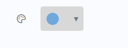
How does this component appear in a web page?
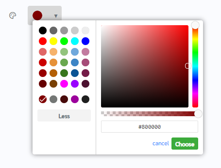
When the component is in focus(color picker is clicked)
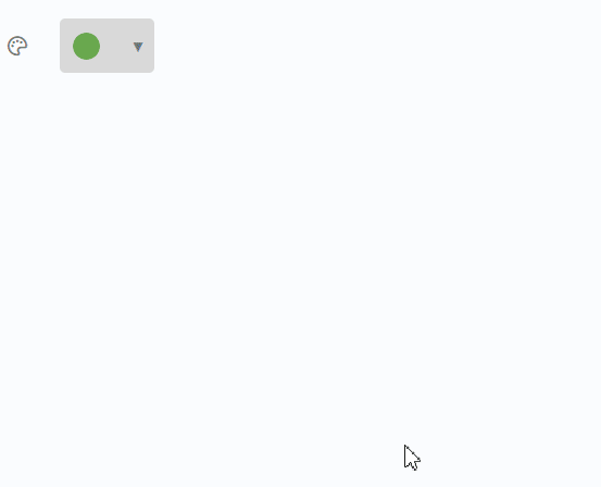
Animation
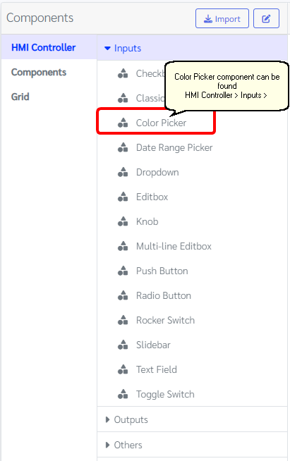
How does this component appears in Aimagin Connect?
What can be configured?
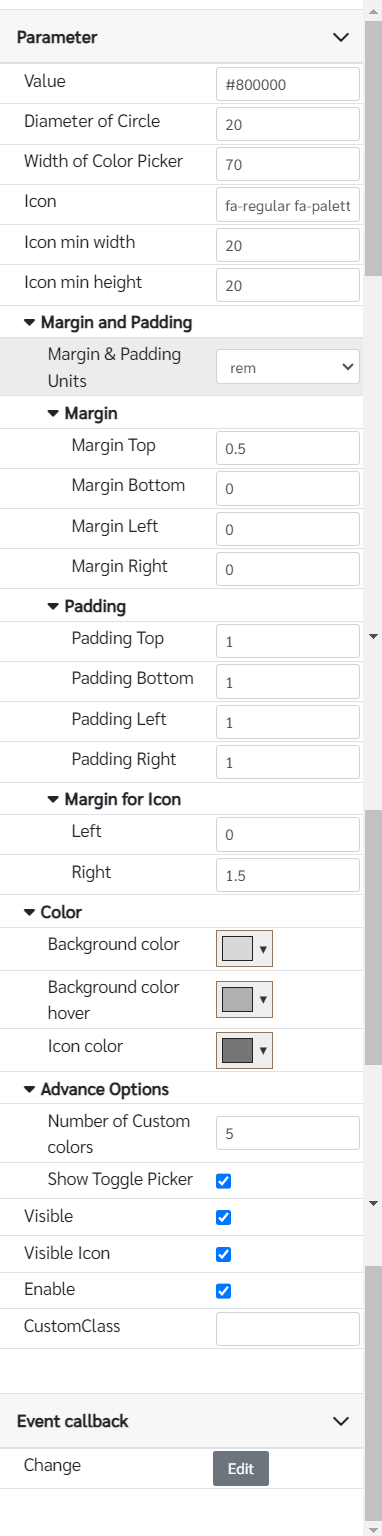
Parameters
Configuration Parameter |
Selectable Option/Value |
Description |
Default Value |
Data type |
Value■■ |
|
The Initial value of the color picker. |
#800000 |
String |
Diameter of Circle■ |
|
Diameter of the circle |
20 |
Number |
Width of Color Picker■■ |
|
Width of Color Picker in pixels |
70 |
Number |
Icon■■ |
|
Font awesome icon class |
fa-regular fa-palette |
String |
Icon min width■■ |
|
Icon min width This may be useful to align more than one color pickers together. Because all fontawesome icons do not have the same sizes. Therefore, giving min size will make it easy to align contents. |
20 |
Number (in pixels) |
Icon min height■■ |
|
Icon min height This may be useful to align more than one color pickers together. Because all fontawesome icons do not have the same sizes. Therefore, giving min size will make it easy to align contents. |
20 |
Number (in pixels) |
Margin and padding |
px--cm--mm--in--pc--pt--ch--em--rem--vh--vw--vmin--vmax |
Margin & padding options for the component, icon and color picker, allowing users to select units. |
rem |
|
Top Margin■■ |
|
Top margin of the component |
0.5 |
Number (in selected unit) |
Bottom Margin■■ |
|
Bottom margin of the component |
0 |
Number (in selected unit) |
Left Margin■■ |
|
Left margin of the component |
0 |
Number (in selected unit) |
Right Margin■■ |
|
Right margin of the component |
0 |
Number (in selected unit) |
Top Padding■■ |
|
Top padding of the component |
1 |
Number (in selected unit) |
Bottom Padding■■ |
|
Bottom padding of the component |
1 |
Number (in selected unit) |
Left Padding■■ |
|
Left padding of the component |
1 |
Number (in selected unit) |
Right Padding■■ |
|
Right padding of the component |
1 |
Number (in selected unit) |
Icon Left Margin■■ |
|
Left margin of the icon |
0 |
Number (in selected unit) |
Icon Right Margin■■ |
|
Right margin of the icon |
1.5 |
Number (in selected unit) |
Background color■■ |
|
Background color of the color picker |
rgb(216, 216, 216) |
Color |
Background color hover■ |
|
Background color of the color picker when hover |
rgb(176, 176, 176) |
Color |
Icon color■■ |
|
Icon color |
rgb(116, 119, 117) |
Color |
Number of Custom colors■ |
|
Number of custom colors in color palette |
5 |
Number |
Show Toggle Picker■ |
|
Show/ Hide Toggle picker of color picker |
true |
Boolean |
Visible■■ |
true--false |
Show hide color picker |
true |
Boolean |
Visible Icon ■■ |
true--false |
Show hide icon |
true |
Boolean |
Enable■■ |
true--false |
Enable disable color picker |
true |
Boolean |
Custom Class■ |
|
Any externally defined classes can be assigned to the color picker from here |
|
String |
■ - getParameter function available - getParameter function needs two input parameters, id and parameter name eg: getParameter('id of the component','parameter name')
■ - setParameter function available - setParameter function needs three input parameters, id, parameter name and the value eg: setParameter('id of the component','parameter name',value)
Event callback
Event callback |
Description |
Change |
This callback will triggered if the color field has a changed |
When to use this component?
The color picker component enables users to interactively select colors for application elements. It provides a visual interface where users can choose from a color area or a predefined palette. This functionality can be utilized to customize the interface of the application, including background colors, text colors, and other visual elements.
How does this component work?
The color picker component provides users with an intuitive interface to explore and select colors, offering real-time feedback as they make their selections. Developers can leverage event handling mechanisms to capture color selection events, allowing for dynamic updates and additional actions within the application to enhance user experience and interactivity.