How does this component appear in a web page?
This component has two styles
1) Circular Marker
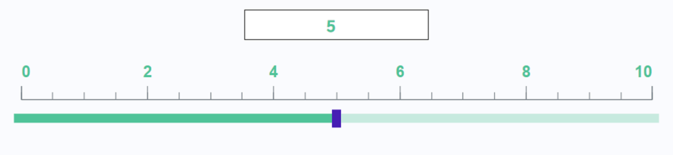
1) Square Marker
Animation
How does this component appears in Aimagin Connect?
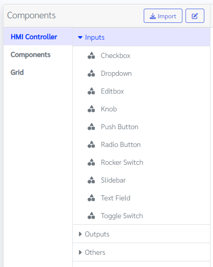
What can be configured?
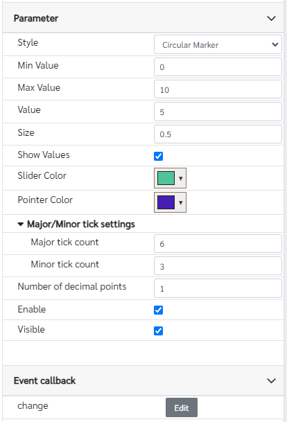
Parameters
Configuration Parameter |
Selectable Option/Value |
Description |
Default Value |
Data type |
Style■ |
Square Marker--Circular Marker |
This sliderbar has two styles one is circular and the other is square. |
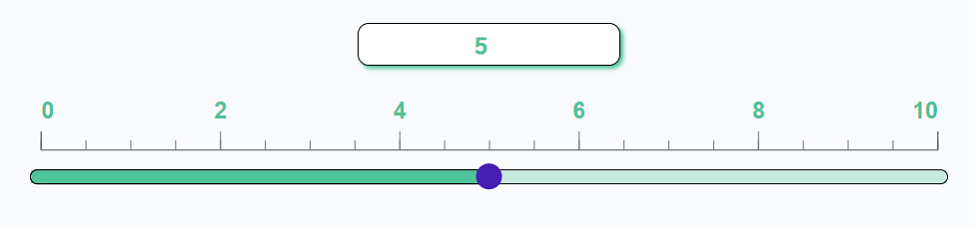
Circular Marker(view_2) |
String |
Min Value■ |
|
Minimum value of the sliderbar |
0 |
Number |
Max Value■ |
|
Minimum value of the sliderbar |
10 |
Number |
Value■■ |
|
Value of the sliderbar |
5 |
Number |
Size■ |
|
Size variable defined the slider size respect to the parent component, value need to be between 0 and 1 |
0.5 |
Number |
Show Values■ |
true--false |
Show hide input field on top of the sliderbar. |
true |
Boolean |
Slider Color■ |
|
Color of the sliderbar |
rgb(79,195,153) |
Color |
Pointer Color■ |
|
Color of the slider pointer |
rgb(70,30,180) |
Color |
Major tick count■ |
|
Number of Major ticks for the component Note that sometimes it will automatically round it off |
6 |
Number |
Minor tick count■ |
|
Number of minor ticks in the major ticks Note that sometimes it will automatically round it off |
3 |
Number |
Number of decimal points■ |
|
Maximum number of decimal points available in the value |
1 |
Number |
Enable■■ |
true--false |
Enable disable sliderbar |
true |
Boolean |
Visible■■ |
true--false |
Show hide sliderbar |
true |
Boolean |
■ - getParameter function available - getParameter function needs two input parameters, id and parameter name eg: getParameter('id of the component','parameter name')
■ - setParameter function available - setParameter function needs three input parameters, id, parameter name and the value eg: setParameter('id of the component','parameter name',value)
Event callback
Event callback |
Description |
Change |
This callback will triggered if the slider value has been changed |
When to use this component?
This component can be used to achieve any graphical web page allowing users to adjust a value between a minimum and maximum range.
How does this component work?
This component is a horizontal slider that allows users to adjust the value by dragging the marker along the slider, clicking on a position, or typing a number in the input field.