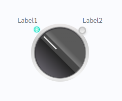
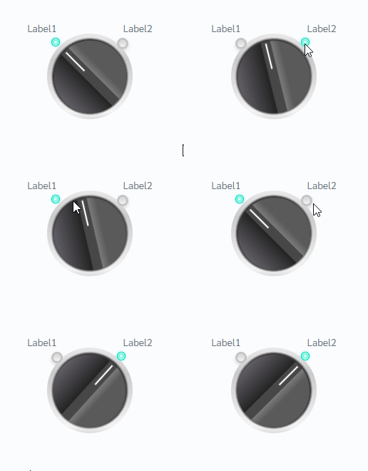
How does this component appear in a web page?

Animation

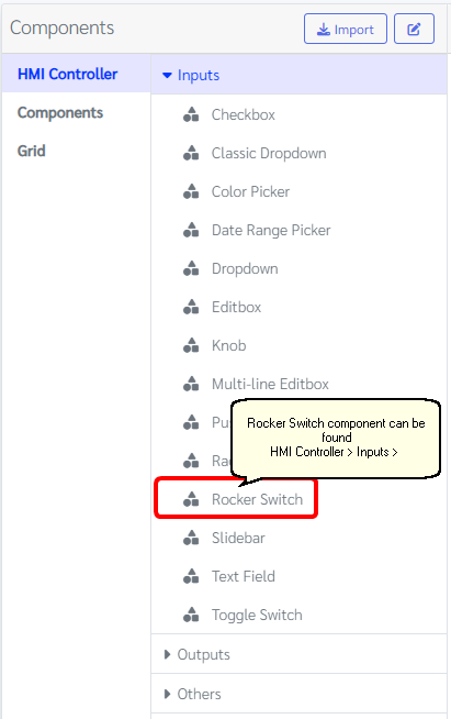
How does this component appears in Aimagin Connect?

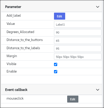
What can be configured?

Parameters
Configuration Parameter |
Selectable Option/Value |
Description |
Default Value |
Data type |
Add label■ |
|
List of rocker switch stops |
['Label1', 'Label2'] |
Object |
Value■■ |
|
Selected value of the rocker switch |
Label1 |
String |
Degrees_Allocated■ |
|
Rocker switch position allocated as degrees |
90 |
Number |
Distance_to_the_buttons■ |
|
Distance to the buttons from the center of the rocker switch |
65 |
Number |
Distance_to_the_labels■ |
|
Distance to the labels from the center of the rocker switch |
95 |
Number |
Margin■ |
|
Margins of the rocker switch |
50px 50px 50px 50px |
String |
Visible■■ |
true--false |
Show/Hide component |
true |
Boolean |
Enable■■ |
true--false |
Enable/Disable component |
true |
Boolean |
■ - getParameter function available - getParameter function needs two input parameters, id and parameter name eg: getParameter('id of the component','parameter name')
■ - setParameter function available - setParameter function needs three input parameters, id, parameter name and the value eg: setParameter('id of the component','parameter name',value)
Event callback
Event callback |
Description |
mouseclick |
This callback will triggered when the rocker switch change the status |
When to use this component?
This component can be used to do any switch-type operations in a web page.
How does this component work?
This component was made using standard HTML tags. Users can customize the position of the labels, the position of the buttons, and degrees allocated to place those elements in the switch. When the mouse clicked on a rocker switch button knob will follow to the same position as a normal switch.