How does this component appear in a web page?
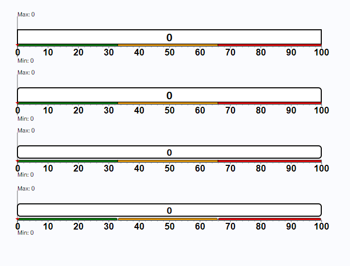
animation
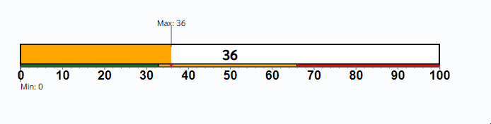
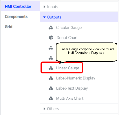
How does this component appears in Aimagin Connect?
What can be configured?
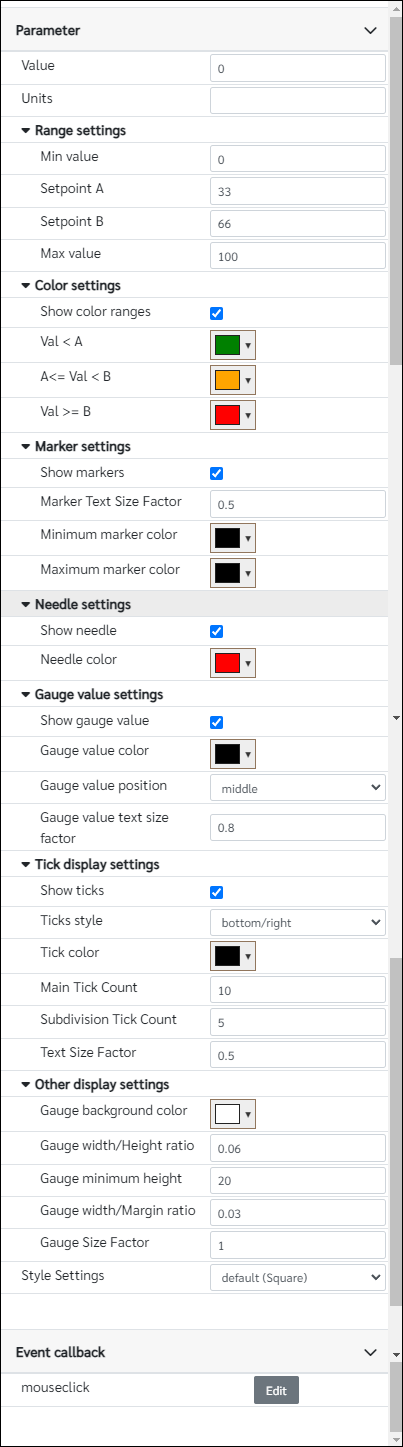
Parameters
Configuration Parameter |
Selectable Option/Value |
Description |
Default Value |
Data type |
Value■■ |
|
Value of the gauge component |
0 |
Number |
Units■■ |
|
If user wants to show an unit in the gauge add units under this parameter |
|
String |
Min value■■ |
|
Minimum value of the gauge |
0 |
Number |
Setpoint A■■ |
|
Set point A is the value that the first color change happen in the gauge |
33 |
Number |
Setpoint B■■ |
|
Set point B is the value that the second color change happen in the gauge |
66 |
Number |
Max value■■ |
|
Minimum value of the gauge |
100 |
Number |
Show color ranges |
true--false |
This parameter can change the status of showing the color ranges in the gauge component |
true |
Boolean |
Val < A■■ |
|
Color when the value is below Setpoint A and Setpoint B (Value < Setpoint A and Value < Setpoint B) |
rgb(0,128,0) |
Color |
A<= Val < B■■ |
|
Color when the value is greater than or equal to Setpoint A and less than Setpoint B (Setpoint A <= Value < Setpoint B) |
rgb(255,165,0) |
Color |
Val >= B■■ |
|
Color when the value is greater than Setpoint A and greater than or equal to Setpoint B (Value > Setpoint A and Value >= Setpoint B) |
rgb(255,0,0) |
Color |
Show markers |
true--false |
Add/Remove markers from the gauge |
true |
Boolean |
Marker Text Size Factor■■ |
|
Enter value between 0 and 1 |
0.5 |
Number |
Minimum marker color |
|
Color of the minimum marker |
rgb(0,0,0) |
Color |
Maximum marker color |
|
Color of the maximum marker |
rgb(0,0,0) |
Color |
Show needle |
true--false |
Enable/Disable needle on the component |
true |
Boolean |
Needle color |
|
Color of the needle |
rgb(255,0,0) |
Color |
Show gauge value |
true--false |
Enable/Disable gauge value on the component |
true |
Boolean |
Gauge value color |
|
Color of the gauge value |
rgb(0,0,0) |
Color |
Gauge value position |
middle--with needle |
Position of the gauge value |
middle |
String |
Gauge value text size factor |
|
Enter value between 0 and 1 |
0.8 |
Number |
Show ticks |
true--false |
Enable/Disable showing ticks on the component |
true |
Boolean |
Ticks style |
both sides--top/left--bottom/right |
Choose tick style |
bottom/right |
String |
Tick color |
|
Color of the ticks |
rgb(0,0,0) |
Color |
Main Tick Count■ |
|
Number of numbered main ticks |
10 |
Number |
Subdivision Tick Count■ |
|
Number of minor ticks in-between two main ticks |
5 |
Number |
Text Size Factor■■ |
|
Enter value between 0 and 1 |
0.5 |
Number |
Margin top■■ |
|
Top margin of the component |
0px |
String |
Margin bottom■■ |
|
Bottom margin of the component |
0px |
String |
Gauge background color■ |
|
Color of the background |
rgb(255,255,255) |
Color |
Gauge width/Height ratio■ |
|
Enter non negative value between 0 and 1 |
0.06 |
Number |
Gauge minimum height■ |
|
Enter minimum height for the component |
20 |
Number (In pixels) |
Gauge width/Margin ratio■ |
|
Enter non negative value between 0 and 1 |
0.03 |
Number |
Gauge Size Factor■■ |
|
Enter value between 0 and 1 |
1 |
Number |
Style Settings |
default (Square)--style_1 (Round top edges)--style_2 (Round corners #1)--style_3 (Round corners #2) |
Choose style |
default (Square)(default) |
String |
■ - getParameter function available - getParameter function needs two input parameters, id and parameter name eg: getParameter('id of the component','parameter name')
■ - setParameter function available - setParameter function needs three input parameters, id, parameter name and the value eg: setParameter('id of the component','parameter name',value)
When to use this component?
This component is based on the d3 library. This component can be used to achieve any graphical web page allowing users to display any value on the gauge component
How does this component work?
When the value parameter has been changed in the gauge, the component will automatically update it on the graphical display. Similarly, this will also be responsive to the parent component(width).