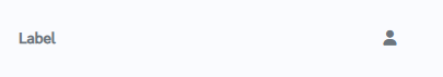
How does this component appear in a web page?
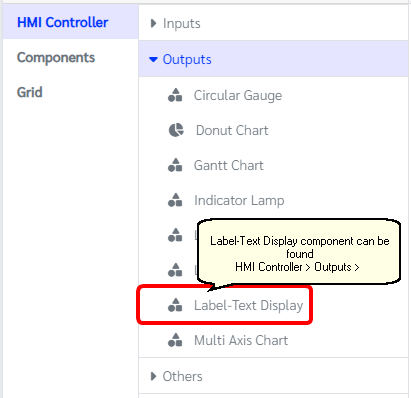
How does this component appears in Aimagin Connect?
What can be configured?
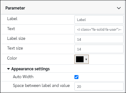
Parameters
Configuration Parameter |
Selectable Option/Value |
Description |
Default Value |
Data type |
Label■■ |
|
The label to be displayed |
Label |
String |
Text■■ |
|
The Font awesome name |
<i class="fa-solid fa-user"></i> |
String |
Label size■■ |
|
Font size of the label |
14 |
Number (in pixels) |
Text size■■ |
|
Font size of the text |
14 |
Number (in pixels) |
Color■■ |
|
Change the color of the text |
rgb(0, 0, 0) |
Color |
Auto Width |
true--false |
Check true if the space between the label and the value takes the entire length of the parent component. (ex: when used within a column) |
true |
Boolean |
Space between label and value■ |
|
Enter a non-negative integer value for the amount of space between the label and the value. (Ineffective if the 'Auto Width' property is checked) |
20 |
Number (in pixels) |
■ - getParameter function available - getParameter function needs two input parameters, id and parameter name eg: getParameter('id of the component','parameter name')
■ - setParameter function available - setParameter function needs three input parameters, id, parameter name and the value eg: setParameter('id of the component','parameter name',value)
When to use this component?
This component can be used to show label with font awesome icon on right
How does this component work?
This component was created using standard HTML tags.