Welcome to next section of tutorial on creating a web application to control a self-balancing robot using Aimagin Connect. Aimagin Connect is a versatile web-based platform that streamlines the development process, enabling users to create web applications through an intuitive drag and drop components, making it accessible even for those with minimal programming experience. Throughout this guide, we will demonstrate how to harness the power of Aimagin Connect to develop a web application that enables remote control of the M5Stack Bala2 robot. We will incorporate push buttons and design the interface to respond to both mouse and touch actions, ensuring compatibility with a wide range of devices, including mobile phones. Get ready to embark on a journey of innovation and convenience as we bring robotics control to your fingertips.
Aimagin Connect Reference: Aimagin Connect User Guide, RC Circuit Stand-alone web-based controller
Aimagin Connect Model: br_Self-Balancing Robot.amgcnt
Aimagin Connect Web app: br_export.zip

Figure 156:Overall Illustration
Step 1: Sign In to the Aimagin Analytics
Sign into your Aimagin Analytics account.

Figure 157: Sign in to Aimagin Analytics
Step 2: Open the Aimagin Connect
Select Aimagin Connect form the navigation bar.

Figure 158: Open Aimagin Connect
Step 3: Rename the Project
Select and Rename the Project name.

Figure 159: Rename the Project
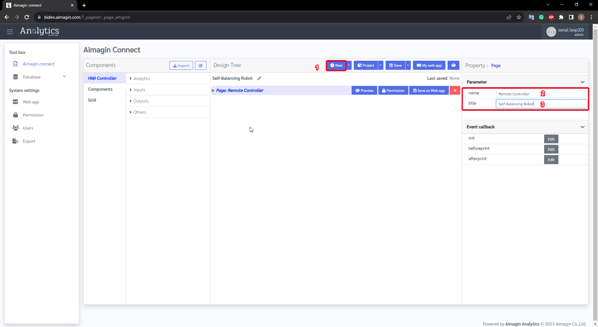
Step 4: Add a new Page
Add new Page to the project and set the name and page title.
Step 5: Add a Flex
Select Grid from the Components and drag & drop Flex in the the page. Change the Background Color parameter of the Flex.

Figure 160: Add Flex Component
Step 6: Add a Label
Add a Label from the Components under the Flex (drag and drop the Label on top of the Flex to make it child component).
Set the Content, Font size, Font color and Margin and padding parameters of the Label component.

Figure 161: Add a Label

Figure 162: Change Margin & Padding
Step 7: Add a Break Line
Select Grid and drag and drop a Break line on top of the Flex component.

Figure 163: Add Breake Line
Step 8: Add a Flex
Select Grid from the Components and drag & drop Flex in the the page. Remove the Background Color parameter of the Flex. Change the Flex-Property according to the following image.

Figure 164: Add a Flex
Step 9: Add two Columns
Select Grid from the Components and drag & drop 2 Columns on top of the Flex. Set the parameters as following figures:

Figure 165: Add First Column and configure

Figure 166: Add Second Column and configure
Step 10: Add a Flex
Select Grid from the Components and drag & drop Flex on top of the column. Remove the Background Color parameter of the Flex. Change the Flex-Property according to the following image.

Figure 167: Add a Flex
Step 11: Add a Flex
Select Grid from the Components and drag & drop Flex on top of the last Flex. Remove the Background Color parameter of the Flex. Change the Flex-Property according to the following image.

Figure 167: Add a Flex
Step 12: Copy and paste two Flex to the second Column
Right-Click on the Flex to copy and right-click under neath the second column to paste.

Figure 168: Copy and Paste Flex to the second Column
Step 13: Add a Label
Add a Label from the Components under the Flex (drag and drop the Label on top of the Flex to make it child component).
Set the Content, Font size, Font color and Text Alignment parameters of the Label component.

Figure 169: Add a Label
Step 14: Add buttons
Add two buttons from the Components under the Flex (drag and drop the Buttons on top of the Flex to make it child component). Change the ID of the buttons to forward and backward. Remove the Text parameter value and change the Size parameter to Large and Custom Class parameter value to pushbuttons.

Figure 170: Add buttons
Step 15: Add Icon to forward button
Add a HTML from the Components under the Button (drag and drop the HTML on top of the Button to make it child component).
Use Fontawesome to get HTML code snippet (<i class="fas fa-angle-double-up fa-2x"></i>) for the icons (only available free and version 5.15.4 Fontawesome icons in the Aimagin Connect Library). Use beat-animation as the Custom Class Parameter value.

Figure 171: Add an icon to forward button
Step 16: Add Icon to backward button
Add a HTML from the Components under the Button (drag and drop the HTML on top of the Button to make it child component).
Use Fontawesome to get HTML code snippet (<i class="fas fa-angle-double-down fa-2x"></i>) for the icons (only available free and version 5.15.4 Fontawesome icons in the Aimagin Connect Library). Use beat-animation as the Custom Class Parameter value.

Figure 172: Add an icon to the backward button
Step 17: Add a Label
Add a Label from the Components under the Flex (drag and drop the Label on top of the Flex to make it child component).
Set the Content, Font size, Font color and Text Alignment parameters of the Label component.

Figure 173: Add a Label
Step 18: Add a Flex
Select Grid from the Components and drag & drop Flex on top of the last Flex. Remove the Background Color parameter of the Flex.

Figure 174: Add a Flex
Step 19: Add buttons
Add two buttons from the Components under the Flex (drag and drop the Buttons on top of the Flex to make it child component). Change the ID of the buttons to left and right . Remove the Text parameter value and change the Size parameter to Large and Custom Class parameter value to pushbuttons.

Figure 175: Add Buttons
Step 20: Add Icon to left button
Add a HTML from the Components under the Button (drag and drop the HTML on top of the Button to make it child component).
Use Fontawesome to get HTML code snippet (<i class="fas fa-angle-double-left fa-2x"></i>) for the icons (only available free and version 5.15.4 Fontawesome icons in the Aimagin Connect Library). Use beat-animation as the Custom Class Parameter value.

Figure 176: Add an icon to left Button
Step 21: Add Icon to right button
Add a HTML from the Components under the Button (drag and drop the HTML on top of the Button to make it child component).
Use Fontawesome to get HTML code snippet (<i class="fas fa-angle-double-right fa-2x"></i>) for the icons (only available free and version 5.15.4 Fontawesome icons in the Aimagin Connect Library). Use beat-animation as the Custom Class Parameter value.

Figure 177: Add an icon to the right Button
Step 22: Add a Flex
Select Grid from the Components and drag & drop Flex in the the page. Change the Background Color parameter of the Flex. Change the Flex-Property according to the following image.

Figure 178: Add a Flex
Step 23: Add a Label
Add a Label from the Components under the Flex (drag and drop the Label on top of the Flex to make it child component).
Set the Content, Font size, Font color and Text Alignment parameters of the Label component.

Figure 179: Add a Label

Figure 180: Change Margin & Padding
Step 24: Save and Preview
Save the Aimagin Connect model and click on Preview.

Figure 181: Save and Preview

Figure 182: Preview
Step 25: Add Callback code
In this step, callback code is added to the page init callback . The code sets up dynamic styles for the page, including a radial gradient background and interactive button and card styling. The script initializes remoteValues for directional movements and defines functions to handle button interactions. Event listeners are attached to buttons for mouse and touch events, updating styles and remoteValues accordingly. The sendDataToBoard function sends remoteValues to a board. Developers are advised to comment out the sendDataToBoard calls for previewing without sending data to the board during development of web application.
Callback code d3.select('head').append('style').html(
`
body {
/* Create a radial gradient background for a more dynamic look */
background: radial-gradient(circle at center, rgb(0, 45, 85), black);
/* Make sure the background covers the entire page */
height: 100vh;
margin: 0;
background-repeat: no-repeat;
background-attachment: fixed;
}
@keyframes beat {
0% { transform: scale(1); }
50% { transform: scale(1.1); }
100% { transform: scale(1); }
}
.beat-animation {
animation: beat 1s infinite;
}
.pushbuttons{
color: rgb(0, 135, 255);
background-color: rgba(255, 255, 255,0.1);
width: 8.0rem;
height: 8.0rem;
border-radius: 15%;
box-shadow: 0px 8px 15px rgba(0, 0, 0, 0.1);
transition: all 0.3s ease 0s;
border: 1px solid rgba(255, 255, 255, 0.3);
backdrop-filter: blur(10px);
}
.pushbuttons:hover {
background-color: rgba(255, 255, 255, 0.1);
box-shadow: 0px 15px 20px rgba(0, 135, 255, 0.4);
color: rgb(0, 135, 255);
transform: translateY(-7px);
border: none;
}
.card {
display: flex;
flex-direction: column;
justify-content: center;
align-items: center;
background-color: rgba(255, 255, 255,0.1);
border-radius: 15px;
box-shadow: 0px 8px 15px rgba(0, 0, 0, 0.1);
transition: all 0.3s ease 0s;
border: 1px solid rgba(255, 255, 255, 0.3);
backdrop-filter: blur(10px);
margin: 10px;
}
.card:hover {
background-color: rgba(255, 255, 255, 0.1);
box-shadow: 0px 15px 20px rgba(0, 135, 255, 0.4);
color: rgb(0, 135, 255);
transform: translateY(-7px);
border: none;
}
.card-title {
font-size: 24px; /* Increase the font size */
font-weight: bold;
margin-bottom: 10px;
color: rgb(0, 135, 255);
text-shadow: 2px 2px rgba(0, 0, 0, 0.2);
text-transform: uppercase; /* Make the title uppercase */
letter-spacing: 2px; /* Increase the spacing between letters */
}
`
);
// Initialize remote values
let remoteValues = {
forward: 0,
backward: 0,
left: 0,
right: 0
};
function sendDataToBoard() {
AmgCnt.Esp32.getData({
mode: 'get_input',
data: remoteValues
}, function(res) {
// Handle the response here
});
}
// Get all buttons in the document
let buttons = document.getElementsByTagName("button");
console.log("Number of buttons: " + buttons.length); // Log the number of buttons
// Convert HTMLCollection to Array and add 'mousedown' and 'mouseup' event listeners to all buttons
Array.prototype.forEach.call(buttons, function(button, i) {
console.log("Adding event listeners to button " + (i + 1)); // Log the current button number
button.dataset.index = i;
button.addEventListener('mouseover', function() {
// ...
// Check which button was hovered over and apply the corresponding transform
if (i === 0) { // Forward button
this.style.transform = "translateY(-7px)";
} else if (i === 1) { // Backward button
this.style.transform = "translateY(7px)";
} else if (i === 2) { // Left button
this.style.transform = "translateX(-7px)";
} else if (i === 3) { // Right button
this.style.transform = "translateX(7px)";
}
});
// Add both mouse and touch event listeners
button.addEventListener('mousedown', buttonPress, false);
button.addEventListener('touchstart', buttonPress, false);
button.addEventListener('mouseup', buttonRelease, false);
button.addEventListener('touchend', buttonRelease, false);
button.addEventListener('mouseleave', buttonRelease, false);
button.addEventListener('touchcancel', buttonRelease, false);
});
// Define the event handlers
function buttonPress(e) {
e.preventDefault(); // Prevent the default action to stop scrolling when touch is used
this.style.backgroundColor = "rgb(0,135,255)";
this.style.color = "rgb(253,253,253)";
let index = Number(this.dataset.index); // Ensure the index is a number
console.log("Button " + (index + 1) + " pressed");
if (index === 0) {
remoteValues.forward = 1;
console.log("Moving Forward");
} else if (index === 1) {
console.log("Moving Backward");
remoteValues.backward = 1;
} else if (index === 2) {
console.log("Turning Left");
remoteValues.left = 1;
} else if (index === 3) {
console.log("Turning Right");
remoteValues.right = 1;
}
sendDataToBoard();// comment this to preview (also line 169)
}
function buttonRelease(e) {
e.preventDefault(); // Prevent the default action to stop scrolling when touch is used
this.style.backgroundColor = "rgba(255, 255, 255, 0.1)";
this.style.color = "rgb(0,135,255)";
this.style.transform = "translateY(0px) translateX(0px)";
let index = Number(this.dataset.index); // Ensure the index is a number
console.log("Button " + (index + 1) + " released");
if (index === 0) {
remoteValues.forward = 0;
} else if (index === 1) {
remoteValues.backward = 0;
} else if (index === 2) {
remoteValues.left = 0;
} else if (index === 3) {
remoteValues.right = 0;
}
sendDataToBoard();// comment this to preview (also line 148)
}

Figure 183: Page init callback

Figure 184: Copy and Paste callback code
Comment out the sendDataToBoard() in the Line 148 and 169 for previewing without sending data to the board during development of web application.

Figure 185: Preview
")
Figure 186: Testing buttons and responsiveness (GIF)
Step 26: Save as Web App
Click in the Save as Web app button to save the web page as web app.

Figure 187: Save as Web App
Step 27: Create web app
Select Web app from the navigation panel and select button create to create the web app. Then select the saved web app.

Figure 188: Create Web App

Figure 189: Select Saved web app
Step 28: Edit Permission
Select Permission from the navigation panel and select edit. Select All button to give full permission and click on the update button.

Figure 190: Edit Permission

Figure 191: Allow full permission
Step 29: Export Esp32 Webapp package
Select the Export from the navigation panel. Web app will be appear on the navigation panel after giving the permission. Select add webapp to select created web app for export.

Figure 192: Add web app to Export

Figure 193: Select created web app

Figure 194: Export the webapp
Step 30: Copy Aimagin Connect exported data to the SD Card
Open 'server' folder in export.rar and copy all to the SD Card
•core folder
•include folder
•system folder
•server.js
Aimagin Connect Web app: br_export.zip

Figure 195: Aimagin Connect Web App Export Package: export.zip
Insert the SD Card to M5stack BALA2 Fire.