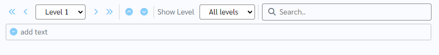
How does this component appear in a web page?
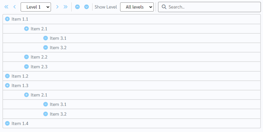
When the component has data
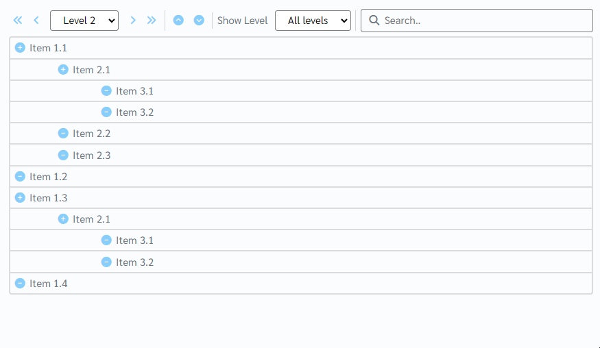
Animation
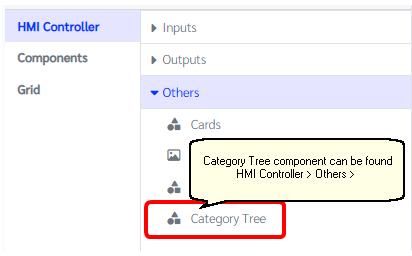
How does this component appears in Aimagin Connect?
What can be configured?
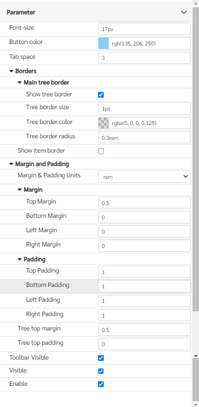
Parameters
Configuration Parameter |
Selectable Option/Value |
Description |
Default Value |
Data type |
Data■■ |
|
Data that has to appear in the Category tree |
|
|
Selected■■ |
|
Selected data from the Category tree |
|
|
Font-size■■ |
|
Font size of the overall component. Note with the number units has to mentioned. |
17px |
String |
Button color■■ |
|
Button color for all the buttons inside the Category tree component |
rgb(135 206 250) |
Color |
Tab space |
|
Tab space of the each tree levels |
5 |
Number |
Show tree border■■ |
true--false |
Show a border around tree object |
true |
Boolean |
Tree border size■■ |
|
Border width of the main border. Note that the units has to mentioned in the parameter. |
1px |
String |
Tree border color■■ |
|
Border color of the main border |
rgba(0, 0, 0, 0.125) |
Color |
Tree border radius■■ |
|
Border radius of the main border. Note that the units has to mentioned in the parameter. |
0.3rem |
String |
Show item border■■ |
true--false |
Show a border around each items in the tree |
false |
Boolean |
Margin and padding Units |
px--cm--mm--in--pc--pt--ch--em--rem--vh--vw--vmin--vmax |
Margin & padding units options for the component, icon and text area |
rem |
String |
Top Margin■■ |
|
Top margin of the component |
0.5 |
Number (in selected unit) |
Bottom Margin■■ |
|
Bottom margin of the component |
0 |
Number (in selected unit) |
Left Margin■■ |
|
Left margin of the component |
0 |
Number (in selected unit) |
Right Margin■■ |
|
Right margin of the component |
0 |
Number (in selected unit) |
Top Padding■■ |
|
Top padding of the component |
1 |
Number (in selected unit) |
Bottom Padding■■ |
|
Bottom padding of the component |
1 |
Number (in selected unit) |
Left Padding■■ |
|
Left padding of the component |
1 |
Number (in selected unit) |
Right Padding■■ |
|
Right padding of the component |
1 |
Number (in selected unit) |
Tree top margin |
|
Top margin of the tree object |
0.5 |
Number (in selected unit) |
Tree top padding |
|
Top padding of the tree object |
0 |
Number (in selected unit) |
Toolbar Visible■■ |
true--false |
Show hide Icon of the editbox |
true |
Boolean |
Visible■■ |
true--false |
Show hide editbox |
true |
Boolean |
Enable■■ |
true--false |
Enable disable editbox |
true |
Boolean |
■ - getParameter function available - getParameter function needs two input parameters, id and parameter name eg: getParameter('id of the component','parameter name')
■ - setParameter function available - setParameter function needs three input parameters, id, parameter name and the value eg: setParameter('id of the component','parameter name',value)
Data format
The format of drawing the items on the Category tree diagram as follows.
[
{ id: "1.1", name: "Item 1.1", selected: false, level: 1, },
{ id: "2.1", name: "Item 2.1", selected: false, level: 2, },
{ id: "3.1", name: "Item 3.1", selected: false, level: 3, },
{ id: "3.2", name: "Item 3.2", selected: false, level: 3, },
{ id: "2.2", name: "Item 2.2", selected: false, level: 2, },
{ id: "2.3", name: "Item 2.3", selected: false, level: 2, },
{ id: "1.2", name: "Item 1.2", selected: false, level: 1, },
{ id: "1.3", name: "Item 1.3", selected: false, level: 1, },
{ id: "2.1", name: "Item 2.1", selected: false, level: 2, },
{ id: "3.1", name: "Item 3.1", selected: false, level: 3, },
{ id: "3.2", name: "Item 3.2", selected: false, level: 3, },
{ id: "1.4", name: "Item 1.4", selected: false, level: 1, },
];
name - the text that appears in the tree
level - the item level
Selected format
Set selected values has to enter as an array format. Like mentioned in the bellow
["Item 3.1","Item 1.2"]
Get values will return all the selected items from the list as an array and it's parents
When to use this component?
This can be used to list-down set of items in a tree kind of format while allowing user to change order and edit item text.
How does this component work?
This component works as a item tree display and it uses SortableJS library to handle the touch and drag options. Also included some keyboard shortcuts to navigate the item easily.
Ctrl + Click - Select/Unselect
Shift + Delete - Remove selected items from the list
Delete/Backspace - Remove items if there is no text
Tab - Increase the level of the selected items
Shift + Tab - Decrease the level of the selected items