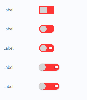
How does this component appear in a web page?
Animation
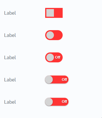
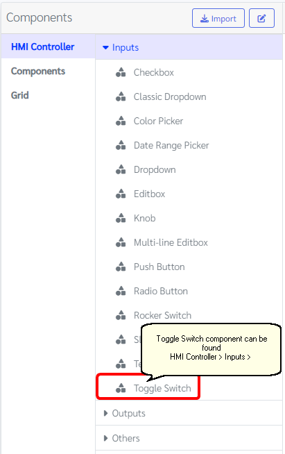
How does this component appears in Aimagin Connect?
What can be configured?
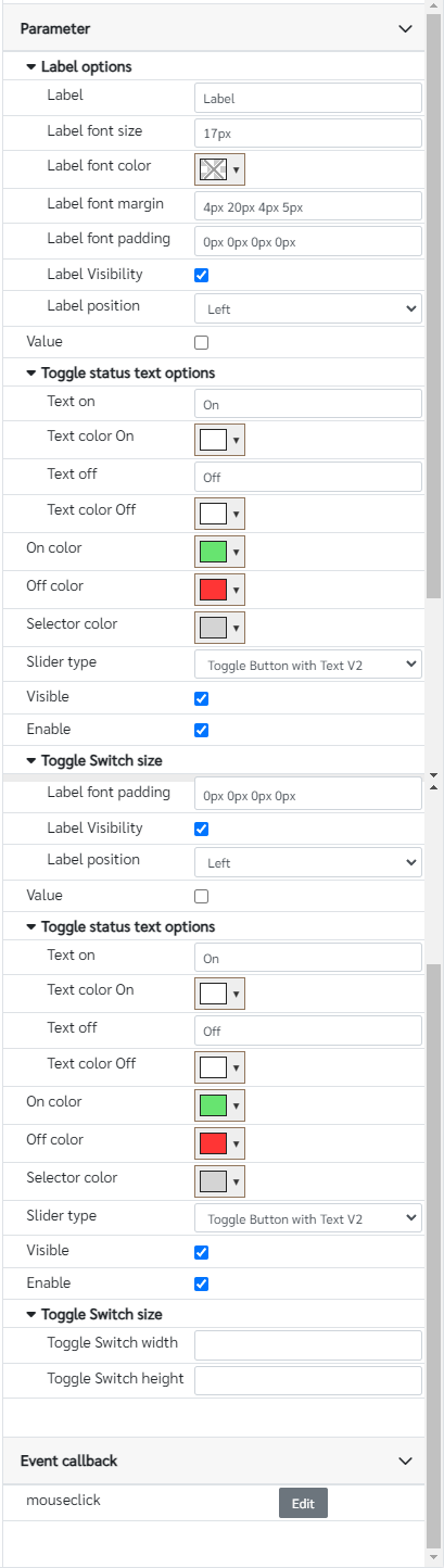
Parameters
Configuration Parameter |
Selectable Option/Value |
Description |
Default Value |
Data type |
Label■■ |
|
Toggle switch label |
Label |
String |
Label font size■■ |
|
Toggle switch label font size, Note this parameter needs to have units |
17px |
String |
Label font color■■ |
|
Toggle switch label font color |
|
Color |
Label font margin■■ |
|
Margin for the toggle switch label, Note this parameter needs to have units. Top, right, bottom and left margins can be individually assigned to the label |
4px 20px 4px 5px |
String |
Label font padding■■ |
|
Padding for the toggle switch label, Note this parameter needs to have units. Top, right, bottom and left padding can be individually assigned to the label |
0px 0px 0px 0px |
String |
Label Visibility■■ |
true--false |
Show/Hide label from the toggle switch |
true |
Boolean |
Label position■■ |
Left--Right |
Label position of the toggle switch |
Left |
String |
Value■■ |
true--false |
Value of the toggle switch |
false |
Boolean |
Text on■ |
|
Toggle switch On status text |
On |
String |
Text color On■ |
|
Toggle switch On status text color |
rgb(255, 255, 255) |
Color |
Text off■ |
|
Toggle switch Off status text |
On |
String |
Text color Off■ |
|
Toggle switch Off status text color |
rgb(255, 255, 255) |
Color |
On color■ |
|
Toggle switch On status color |
rgb(103, 228, 112) |
Color |
Off color■ |
|
Toggle switch Off status color |
rgb(255, 53, 53) |
Color |
Selector color■ |
|
Selector color |
rgb(212, 212, 212) |
Color |
Slider type■■ |
Rectangular switch--Rounded switch--Toggle Button with Text--Toggle Button with Text V2--Toggle Button with Text Sliding |
There are 5 types of toggle switch can be use from this component. |
Toggle Button with Text V2 |
String |
Visible■■ |
true--false |
Show/Hide component |
true |
Boolean |
Enable■■ |
true--false |
Enable/Disable component |
true |
Boolean |
Toggle Switch width■■ |
|
Toggle Switch width in pixels, Leaving this parameter empty will automatically assign default values for the component |
|
Number |
Toggle Switch height■■ |
|
Toggle Switch height in pixels, Leaving this parameter empty will automatically assign default values for the component |
|
Number |
■ - getParameter function available - getParameter function needs two input parameters, id and parameter name eg: getParameter('id of the component','parameter name')
■ - setParameter function available - setParameter function needs three input parameters, id, parameter name and the value eg: setParameter('id of the component','parameter name',value)
Event callback
Event callback |
Description |
mouseclick |
This callback will triggered when the toggle switch is clicked |
When to use this component?
This component is a switch which has only two status. To select on/off status this component would be idle to use.
How does this component work?
This component is based on standard HTML tags with custom stylings. Users can easily select which type of format is needed from the slider type. Every click will change its status continuously.