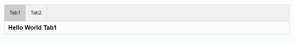
How does this component appear in a web page?
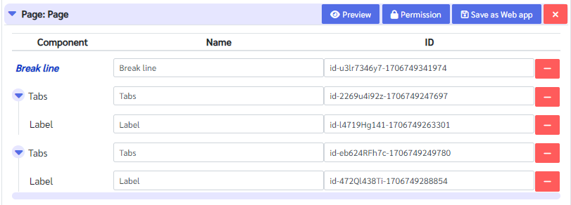
Aimagin connect design tree structure:
Animation
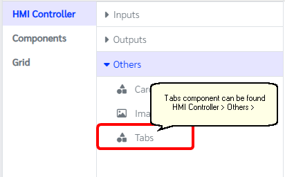
How does this component appears in Aimagin Connect?
What can be configured?
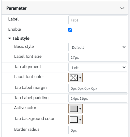
Parameters
Configuration Parameter |
Selectable Option/Value |
Description |
Default Value |
Data type |
Label■ |
|
Tab lable |
|
String |
Enable■■ |
true--false |
Enable/Disable tab |
true |
Boolean |
Basic style■■ |
Default--Default2 |
Design has two styles which will only be different from the border arrengments |
|
String |
Label font size |
|
Tab label font size |
17px |
String |
Tab alignment |
Left--Right--Center |
Tab label positions |
Left |
String |
Label font color |
|
Tab label font color |
|
Color |
Tab Label margin |
|
Tab label margins. From this parameter it can also adjust the top,bottom,right and left margins individually. Note that parameter should have units |
0px 0px 0px 0px |
String |
Tab Label padding |
|
Tab label padding. From this parameter it can also adjust the top,bottom,right and left paddings individually. Note that parameter should have units |
14px 16px |
String |
Active color |
|
Tab color when it is active |
rgb(204, 204, 204) |
Color |
Tab background color |
|
Tab background color |
rgb(241, 241, 241) |
Color |
Border radius |
|
Entire tab border width |
0px |
String |
■ - getParameter function available - getParameter function needs two input parameters, id and parameter name eg: getParameter('id of the component','parameter name')
■ - setParameter function available - setParameter function needs three input parameters, id, parameter name and the value eg: setParameter('id of the component','parameter name',value)
Note: Tab components will behave depend on the sibling tabs. First Tab in a set will be the main tab and the style settings will be taken from it.
When to use this component?
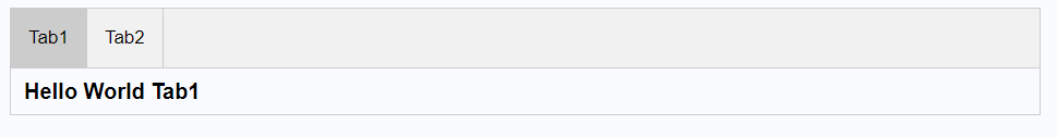
This component can be used to group and make tabs as shown in the first picture.
How does this component work?
This component will need to have sibling tab components to show a group of tabs. The first tab component will be the main tab component in that group and it will overwrite some of the parameters for the other sibling tabs. Tab component accepts children(Components to be in the tab component) and clicking on a label can view contents under that tab.