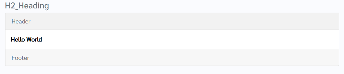
How does this component appear in a web page?
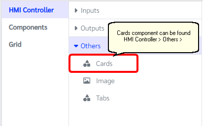
How does this component appears in Aimagin Connect?
What can be configured?
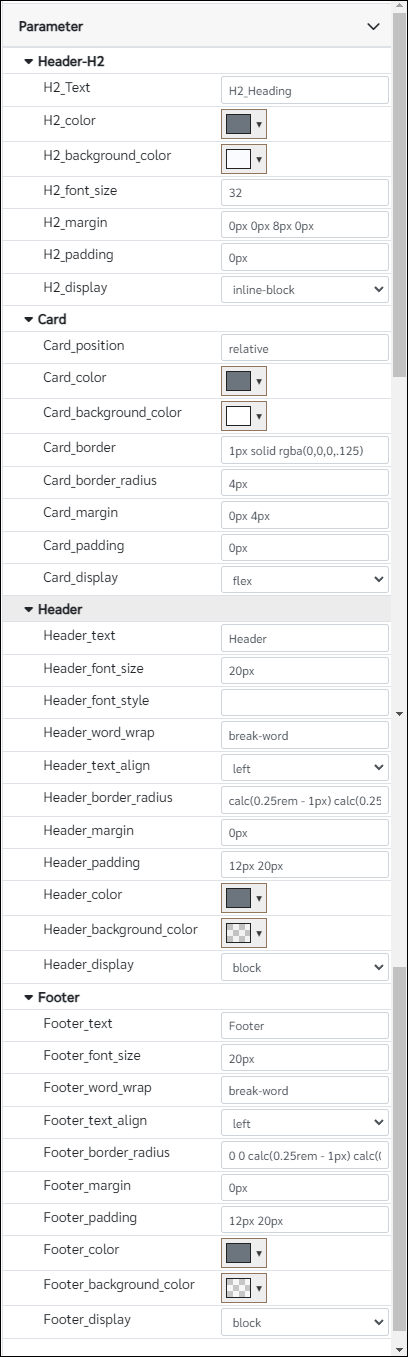
Parameters
Configuration Parameter |
Selectable Option/Value |
Description |
Default Value |
Data type |
H2_Text |
|
Main heading text |
H2_Heading |
String |
H2_color |
|
Main heading color |
rgb(108, 117, 125) |
Color |
H2_background_color |
|
Main heading background color |
rgb(250, 251, 254) |
Color |
H2_font_size |
|
Main heading font size |
32 |
Number (In pixles) |
H2_margin |
|
Main heading margin, Note parameter should have units |
0px 0px 8px 0px |
String |
H2_padding |
|
Main heading padding, Note parameter should have units. Like in the margins parameter can control top,left,bottom and right paddings |
0px |
Number (In pixles) |
H2_display |
none--inline--block--inline-block |
Main heading display property specifies the display behavior |
inline-block |
String |
Card_position |
|
Card position property specifies the type of positioning method used for the component |
relative |
String |
Card_color |
|
Color of the card |
rgb(108, 117, 125) |
Color |
Card_background_color |
|
Background color of the card |
rgb(255, 255, 255) |
Color |
Card_border |
|
This parameter will adjust the border width, boarder style and the color of the border for the card element |
1px solid rgba(0,0,0,.125) |
String |
Card_border_radius |
|
Border radius of the card, Note parameter should have units |
4px |
String |
Card_margin |
|
Margin for the component. From this parameter it can also adjust the top,bottom,right and left margins individually. Note that parameter should have units |
0px 4px |
String |
Card_padding |
|
Padding for the component. From this parameter it can also adjust the top,bottom,right and left paddings individually. Note that parameter should have units |
0px |
String |
Card_display |
none--inline--block--inline-block--flex |
Card display property specifies the display behavior |
flex |
String |
Header_text |
|
Card header text |
Header |
String |
Header_font_size |
|
Card header font size, Note that this parameter need to have units |
20px |
String |
Header_font_style |
|
This property sets how thick or thin characters in text should be displayed. eg: normal|bold|bolder|lighter |
|
String |
Header_word_wrap |
|
This property allows long words to be able to be broken and wrap onto the next line. eg: normal|break-word|initial|inherit |
break-word |
String |
Header_text_align |
left--center--right |
Card header text alignment |
left |
|
Header_border_radius |
|
This parameter calculate the border radius for the header section |
calc(0.25rem - 1px) calc(0.25rem - 1px) 0 0 |
String |
Header_margin |
|
header section margins |
0px |
String |
Header_padding |
|
header section paddings |
12px 20px |
String |
Header_color |
|
Header text color |
rgb(108, 117, 125) |
Color |
Header_background_color |
|
Header background color |
rgba(0, 0, 0, 0.05) |
Color |
Header_display |
none--inline--block--inline-block--flex |
Header display behavior |
block |
String |
Footer_text |
|
Card footer text |
Footer |
String |
Footer_font_size |
|
Card footer font size |
20px |
String |
Footer_word_wrap |
|
This property allows long words to be able to be broken and wrap onto the next line. eg: normal|break-word|initial|inherit |
break-word |
String |
Footer_text_align |
left--center--right |
Card foother text alignment |
left |
String |
Footer_border_radius |
|
This parameter calculate the border radius for the footer section |
0 0 calc(0.25rem - 1px) calc(0.25rem - 1px) |
String |
Footer_margin |
|
Footer section margins |
0px |
String |
Footer_padding |
|
Footer section paddings |
12px 20px |
String |
Footer_color |
|
Footer text color |
rgb(108, 117, 125) |
String |
Footer_background_color |
|
Footer background color |
rgba(0, 0, 0, 0.03) |
String |
Footer_display |
none--inline--block--inline-block--flex |
Footer display behavior |
none |
String |
■ - getParameter function available - getParameter function needs two input parameters, id and parameter name eg: getParameter('id of the component','parameter name')
■ - setParameter function available - setParameter function needs three input parameters, id, parameter name and the value eg: setParameter('id of the component','parameter name',value)
When to use this component?
This component can be used to group a section and used as a card on the web page. Note that this component is not support for any setParameter and getParameter functions for any of the available parameters
How does this component work?
This component accepts child components to be in the card component. Therefore, when designing, the user needs to drag the component inside to show on the card.