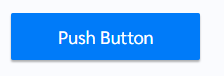
How does this component appear in a web page?
Animation
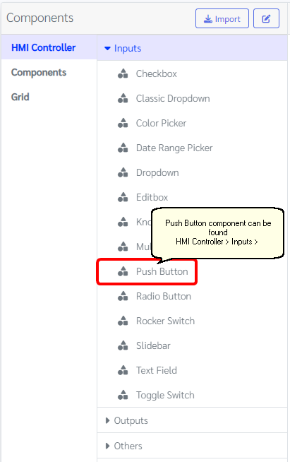
How does this component appears in Aimagin Connect?
What can be configured?
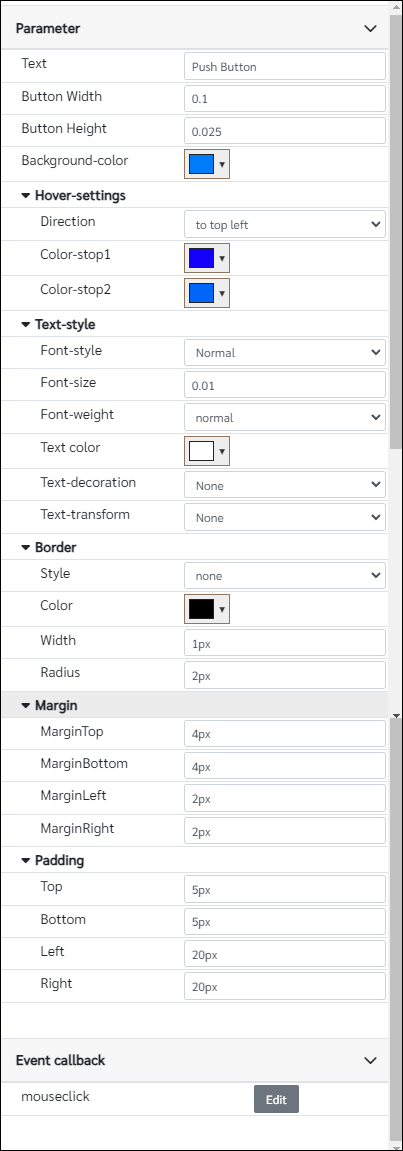
Parameters
Configuration Parameter |
Selectable Option/Value |
Description |
Default Value |
Data type |
Text■■ |
|
Push button text |
Push Button |
String |
Button Width■■ |
|
Button width as a factor of the parent element width, Note this number should be less than or equal 1 |
0.1 |
Number |
Button Height■■ |
|
Button height as a factor of the parent element width |
0.025 |
Number |
Background-color■■ |
|
Background-color of Push button |
rgba(0, 123, 249, 1) |
Color |
Direction■■ |
to top--to bottom--to left--to right--to top left--to top right--to bottom left--to bottom right |
Direction of color gradient is applied to the Push button when hover |
to bottom |
String |
Color-stop1■■ |
|
Hovering color 1 |
rgba(0, 123, 249, 1) |
Color |
Color-stop2■■ |
|
Hovering color 2 |
rgba(0, 123, 249, 1) |
Color |
Font-style■■ |
Normal--Italic |
Font style of the push button |
Normal(normal) |
String |
Font-size■■ |
|
Font-size as a factor of the parent element width |
0.01 |
Number |
Font-weight■■ |
normal--bold |
Font-weight of Push button |
normal |
String |
Text color■■ |
|
Text color of Push button |
rgba(255, 255, 255, 1) |
Color |
Text-decoration■■ |
None--Underline--Overline--Line-through |
Decoration of the text |
None(none) |
String |
Text-transform■■ |
None--Uppercase--Lowercase |
Transform of the text |
None(none) |
String |
Style■■ |
none--solid--dotted--dashed--double--groove--ridge--inset--outset |
Border style |
none |
String |
Color■■ |
|
Border color |
rgba(0,0,0,1) |
Color |
Width■■ |
|
Border width, Note that this parameter needs to have units |
1px |
String |
Radius■■ |
|
Border radius, Note that this parameter needs to have units |
2px |
String |
MarginTop■■ |
|
Label top margin |
4px |
String |
MarginBottom■■ |
|
Label bottom margin |
4px |
String |
MarginLeft■■ |
|
Label left margin |
2px |
String |
MarginRight■■ |
|
Label right margin |
2px |
String |
Top■■ |
|
Label top padding |
5px |
String |
Bottom■■ |
|
Label bottom padding |
5px |
String |
Left■■ |
|
Label left padding |
20px |
String |
Right■■ |
|
Label right padding |
20px |
String |
■ - getParameter function available - getParameter function needs two input parameters, id and parameter name eg: getParameter('id of the component','parameter name')
■ - setParameter function available - setParameter function needs three input parameters, id, parameter name and the value eg: setParameter('id of the component','parameter name',value)
Event callback
Event callback |
Description |
mouseclick |
This callback will triggered if the push button is clicked |
When to use this component?
This component can be used to do any push button tasks.
How does this component work?
This component was made using standard HTML tags with some styling to make it customizable for the user from the parameter list. Note that this element's size will depend on the parent width. Therefore give correct parameter numbers to the fields.