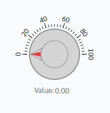
How does this component appear in a web page?
Animation
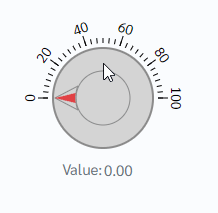
How does this component appears in Aimagin Connect?
What can be configured?
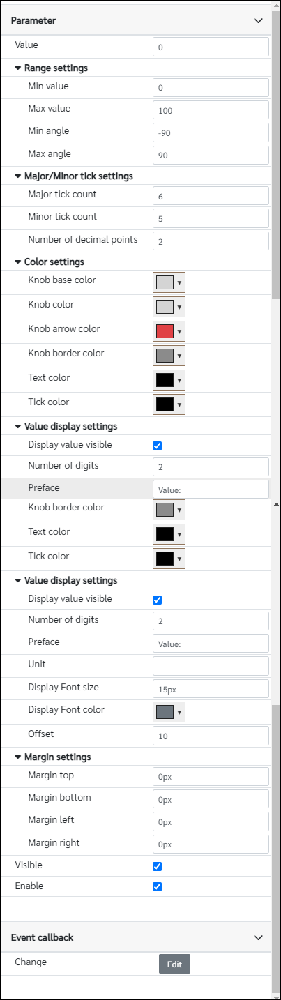
Parameters
Configuration Parameter |
Selectable Option/Value |
Description |
Default Value |
Data type |
Value■■ |
|
The initial value of the display for the knob |
0 |
Number |
Min value■■ |
|
Minimum value of the gauge |
0 |
Number |
Max value■■ |
|
Maximum value of the gauge |
100 |
Number |
Min angle■■ |
|
Minimum angle assign to the knob from the center |
-90 |
Number |
Max angle■■ |
|
Maximum angle assign to the knob from the center |
90 |
Number |
Major tick count■■ |
|
Number of major ticks |
6 |
Number |
Minor tick count■■ |
|
Number of minor ticks |
5 |
Number |
Number of decimal points■■ |
|
Number of decimal points |
2 |
Number |
Knob base color■■ |
|
Color of the Knob base |
rgb(212, 212, 212) |
Color |
Knob color■■ |
|
Color of the Knob |
rgb(212, 212, 212) |
Color |
Knob arrow color■■ |
|
Color of the Knob arrow |
rgb(224, 65, 69) |
Color |
Knob border color■■ |
|
Color of the Knob border |
rgb(139, 139, 139) |
Color |
Text color■■ |
|
Text color of the ticks |
rgb(0,0,0) |
Color |
Tick color■■ |
|
Tick color |
rgb(0,0,0) |
Color |
Display value visible■■ |
true--false |
Show/Hide display value |
true |
Boolean |
Number of digits■■ |
|
Number of digits shown in the display |
2 |
Number |
Preface■■ |
|
Word added before the value |
Value: |
String |
Unit■■ |
|
Word added after the value |
|
String |
Display Font size■■ |
|
Display value font size, Note parameter should have units |
15px |
String |
Display Font color■■ |
|
Color of the display font |
rgb(108, 117, 125) |
Color |
Offset■■ |
|
Show value offset from the bottom of the knob component. |
10 |
Number (in pixels) |
Margin top■■ |
|
Component top margin, Note parameter should have units |
0px |
String |
Margin bottom■■ |
|
Component bottom margin, Note parameter should have units |
0px |
String |
Margin left■■ |
|
Component left margin, Note parameter should have units |
0px |
String |
Margin right■■ |
|
Component right margin, Note parameter should have units |
0px |
String |
Visible■■ |
true--false |
Show/Hide component |
true |
Boolean |
Enable■■ |
true--false |
Enable/Disable component |
true |
Boolean |
■ - getParameter function available - getParameter function needs two input parameters, id and parameter name eg: getParameter('id of the component','parameter name')
■ - setParameter function available - setParameter function needs three input parameters, id, parameter name and the value eg: setParameter('id of the component','parameter name',value)
Event callback
Event callback |
Description |
Change |
This callback will triggered if the knob value is changed |
When to use this component?
The knob component can be used to tune values on a web page. Maximum and Minimum values can be tuned from the parameter as well.
How does this component work?
This component was made using the d3 library and there are several events running inside to keep track of the knob value. Value can be changed using mouse click, mouse drag, and mouse scroll.