How does this component appear in a web page?
This component has 10 styles which are Full gauge, Half gauge, Quarter gauge (Q1) CW, Quarter gauge (Q1) CCW, Quarter gauge (Q2) CW, Quarter gauge (Q2) CCW, Quarter gauge (Q3) CW, Quarter gauge (Q3) CCW, Quarter gauge (Q4) CW, and Quarter gauge (Q4) CCW.
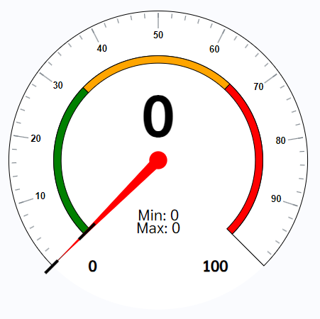
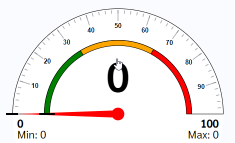
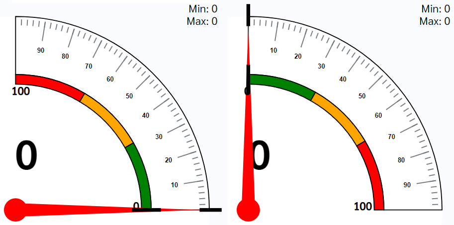
Pictures above show how the Full gauge, Half gauge, Quarter gauge (Q1) CW, and Quarter gauge (Q1) CCW in the web pages. Design for quarter for all direction can be found in the styles.
Note: Size of this component will take proportion of the parent width. Therefore it is better to use this component in a div or col component to define the width of the component.
Animation
How does this component appears in Aimagin Connect?
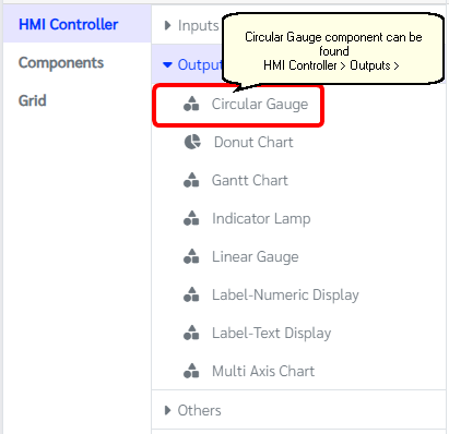
What can be configured?
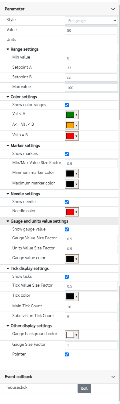
Parameters
Configuration Parameter |
Selectable Option/Value |
Description |
Default Value |
Data type |
Style |
Full gauge--Half gauge--Quarter gauge (Q1) CW--Quarter gauge (Q1) CCW--Quarter gauge (Q2) CW--Quarter gauge (Q2) CCW--Quarter gauge (Q3) CW--Quarter gauge (Q3) CCW--Quarter gauge (Q4) CW--Quarter gauge (Q4) CCW |
This gauge component has 10 styles |
Full gauge(view_1) |
String |
Value■■ |
|
Value of the gauge component |
0 |
Number |
Units■■ |
|
If user wants to show an unit in the gauge add units under this parameter |
|
String |
Min value■■ |
|
Minimum value of the gauge |
0 |
Number |
Setpoint A■■ |
|
Set point A is the value that the first color change happen in the gauge |
33 |
Number |
Setpoint B■■ |
|
Set point B is the value that the second color change happen in the gauge |
66 |
Number |
Max value■■ |
|
Minimum value of the gauge |
100 |
Number |
Show color ranges |
true--false |
This parameter can change the status of showing the color ranges in the gauge component |
true |
Boolean |
Val < A■■ |
|
Color when the value is below Setpoint A and Setpoint B (Value < Setpoint A and Value < Setpoint B) |
rgb(0,128,0) |
Color |
A<= Val < B■■ |
|
Color when the value is greater than or equal to Setpoint A and less than Setpoint B (Setpoint A <= Value < Setpoint B) |
rgb(255,165,0) |
Color |
Val >= B■■ |
|
Color when the value is greater than Setpoint A and greater than or equal to Setpoint B (Value > Setpoint A and Value >= Setpoint B) |
rgb(255,0,0) |
Color |
Show markers |
true--false |
Add/Remove markers from the gauge |
true |
Boolean |
Min/Max Value Size Factor■■ |
|
Size of the Min/Max value. Enter value between 0 and 1 |
0.5 |
Number |
Minimum marker color |
|
Color of the minimum marker |
rgb(0,0,0) |
Color |
Maximum marker color |
|
Color of the maximum marker |
rgb(0,0,0) |
Color |
Show needle |
true--false |
Enable/Disable needle on the component |
true |
Boolean |
Needle color |
|
Color of the needle |
rgb(255,0,0) |
Color |
Show gauge value |
true--false |
Enable/Disable gauge value on the component |
true |
Boolean |
Gauge Value Size Factor■■ |
|
Size of the gauge value. Enter value between 0 and 1 |
0.5 |
Number |
Units Value Size Factor■■ |
|
Size of the units. Enter value between 0 and 1 |
0.5 |
Number |
Gauge value color |
|
Color of the gauge value |
rgb(0,0,0) |
Color |
Show ticks |
true--false |
Enable/Disable showing ticks on the component |
true |
Boolean |
Tick Value Size Factor■■ |
|
Size of the ticks. Enter value between 0 and 1 |
0.5 |
Number |
Tick color |
|
Color of the ticks |
rgb(0,0,0) |
Color |
Main Tick Count■ |
|
Number of numbered main ticks |
10 |
Number |
Subdivision Tick Count■ |
|
Number of minor ticks in-between two main ticks |
5 |
Number |
Gauge background color■■ |
|
Color of the background |
rgb(255,255,255) |
Color |
Gauge Size Factor■■ |
|
Gauge size respective to the parent width. Enter value between 0 and 1 |
1 |
Number |
Pointer■ |
true--false |
Change cursor to a pointer when hover on the component |
true |
Boolean |
■ - getParameter function available - getParameter function needs two input parameters, id and parameter name eg: getParameter('id of the component','parameter name')
■ - setParameter function available - setParameter function needs three input parameters, id, parameter name and the value eg: setParameter('id of the component','parameter name',value)
Event callback
Event callback |
Description |
mouseclick |
This callback will triggered if gauge component is clicked |
When to use this component?
This component can be used to achieve any graphical web page allowing users to display any value on the gauge component with 10 different styles.
How does this component work?
When the value parameter has been changed in the gauge, the component will automatically update it on the graphical display. Similarly, this will also be responsive to the parent component(width).