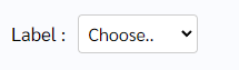
How does this component appear in a web page?
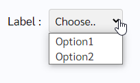
When the component is opened the dropdown
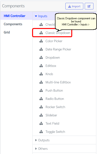
How does this component appears in Aimagin Connect?
What can be configured?
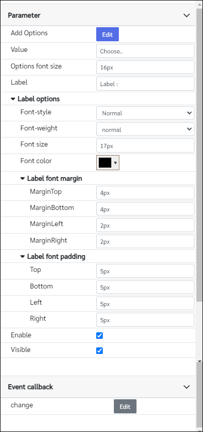
Parameters
Configuration Parameter |
Selectable Option/Value |
Description |
Default Value |
Data type |
Add Options■■ |
|
List of options that available in the dropdown |
['Option1', 'Option2'] |
Object |
Value■■ |
|
Text size of the label and the input field |
Choose.. |
String |
Options font size |
|
Font size of the dropdown. Note that unites has to be in the parameter |
16px |
String |
Label■■ |
|
Label text |
Label : |
String |
Font-style■■ |
Normal--Italic |
Label font style |
Normal(normal) |
String |
Font-weight■■ |
normal--bold |
Label font weight |
normal |
String |
Font size■■ |
|
Font size of the label. Note that unites has to be in the parameter |
17px |
String |
Font color■■ |
|
Label font color |
rgba(0 ,0 ,0 , 1) |
Color |
MarginTop■■ |
|
Label top margin |
4px |
String |
MarginBottom■■ |
|
Label bottom margin |
4px |
String |
MarginLeft■■ |
|
Label left margin |
2px |
String |
MarginRight■■ |
|
Label right margin |
2px |
String |
Top■■ |
|
Label top padding |
5px |
String |
Bottom■■ |
|
Label bottom padding |
5px |
String |
Left■■ |
|
Label left padding |
5px |
String |
Right■■ |
|
Label right padding |
5px |
String |
Enable■■ |
true--false |
Enable/Disable component |
true |
Boolean |
Visible■■ |
true--false |
Show/Hide component |
true |
Boolean |
■ - getParameter function available - getParameter function needs two input parameters, id and parameter name eg: getParameter('id of the component','parameter name')
■ - setParameter function available - setParameter function needs three input parameters, id, parameter name and the value eg: setParameter('id of the component','parameter name',value)
Event callback
Event callback |
Description |
Change |
This callback will triggered if the dropdown has a changed |
When to use this component?
This can be used for any web page to choose a value from a dropdown list.
How does this component work?
When the click on select component it will expand the list of choices that have been added to the Add options parameter. If the user-defined the callback, it will be triggered the functions inside when the Value has been changed.