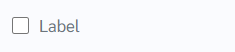
How does this component appear in a web page?
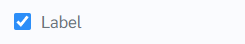
When the component is checked
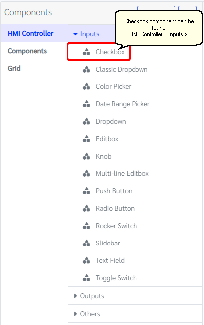
How does this component appears in Aimagin Connect?
What can be configured?
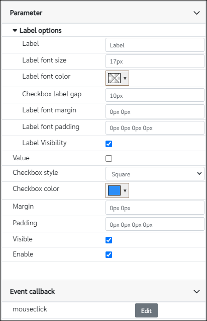
Parameters
Configuration Parameter |
Selectable Option/Value |
Description |
Default Value |
Data type |
Label■■ |
|
Label text |
Label |
String |
Label font size■■ |
|
Text size of the label, This value need to have with the units |
17px |
String |
Label font color |
|
Color of the label |
|
Color |
Checkbox label gap■■ |
|
Gap between label and the checkbox, This value need to have with the units |
10px |
String |
Label font margin■■ |
|
Margin values of the label |
0px 0px |
String |
Label font padding■■ |
|
Padding values of the label |
0px 0px 0px 0px |
String |
Label Visibility■■ |
true--false |
Show/Hide label |
true |
Boolean |
Value■■ |
true--false |
Initial value of the checkbox |
false |
Boolean |
Checkbox style■■ |
Square--Round--Square filled--Round filled |
Checkbox style |
Square |
String |
Checkbox color■■ |
|
Color of the checkbox when checked |
rgb(44, 142, 248) |
Color |
Margin■■ |
|
Margin for the component |
0px 0px |
String |
Padding■■ |
|
Padding for the component |
0px 0px 0px 0px |
String |
Visible■■ |
true--false |
Show/Hide component |
true |
Boolean |
Enable■■ |
|
Enable/Disable component |
true |
Boolean |
■ - getParameter function available - getParameter function needs two input parameters, id and parameter name eg: getParameter('id of the component','parameter name')
■ - setParameter function available - setParameter function needs three input parameters, id, parameter name and the value eg: setParameter('id of the component','parameter name',value)
Event callback
Event callback |
Description |
mouseclick |
This callback will triggered when the checkbox is clicked or changed |
When to use this component?
This can be used as a checkbox for any web page and it has multiple styles that users can customize and used.
How does this component work?
This component has an event for detecting the status. To grab the status of the component value users can use the getParameter option. Depending on the status and the style the user has selected appearance and the status showing on the web page will be changed.