How does this component appear in a web page?

Classic Style

Modern Style
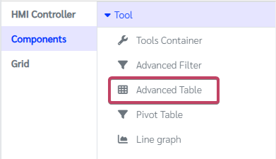
How does this component appears in Aimagin Connect?
What can be configured?
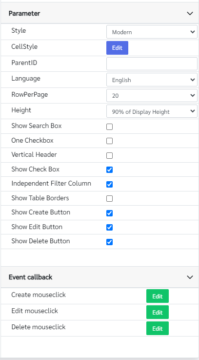
Parameters
Configuration Parameter |
Selectable Option/Value |
Description |
Default Value |
Data type |
Style■■ |
Classic--Modern |
Design has two styles. |
Modern |
String |
CellStyle■■ |
|
This is used to customize the look of a table |
|
string |
Data (hidden from the parameters page)■■ |
|
This is used to set the display of data. ID = “Data” |
|
string |
Selected (hidden from the parameters page)■■ |
|
This is used to set the checkbox for the table. ID = “Selected” setParameter Select the row to check the Checkbox or reset all checkboxes |
|
string |
Update (hidden from the parameters page)■ |
|
This is used to cause the table to be updated with new data. ID = “Update” |
|
string |
ParentID■■ |
|
This is used with toolsContainer to select the ID of the widget to receive data from |
|
String |
Language■■ |
English--Thai |
Select the language |
English |
String |
RowPerPage■■ |
10--15--20--25--50--75--100--200--500--1000 |
Number of rows per a page |
50 |
String |
Height■■ |
50%--60%--70%--80%--90%--95%--100% of Display Height |
Change the Height of the table with proportion to the display size |
90% of Display Height |
String |
Show Search Box■■ |
true--false |
Change the visibility of the search box. |
false |
Boolean |
One Checkbox■■ |
true--false |
Able To Select Only One Checkbox |
false |
Boolean |
Vertical Header■■ |
true--false |
Change the header from horizontal to vertical |
false |
Boolean |
Show Check Box■■ |
true--false |
Change the visibility of the check boxes |
true |
Boolean |
Independent Filter Column■■ |
true--false |
This allows users to filter the data in the table by the values of each individual column |
true |
Boolean |
Show Table Borders■■ |
true--false |
Change the visibility of the table body borders(Only available in Modern style) |
false |
Boolean |
Show Create Button■■ |
true--false |
Change the visibility of the Create button(Only available in Modern style) |
true |
Boolean |
Show Edit Button■■ |
true--false |
Change the visibility of the Edit button(Only available in Modern style) |
true |
Boolean |
Show Delete Button■■ |
true--false |
Change the visibility of the Delete button(Only available in Modern style) |
true |
Boolean |
■ - getParameter function available - getParameter function needs two input parameters, id and parameter name eg: getParameter('id of the component','parameter name')
■ - setParameter function available - setParameter function needs three input parameters, id, parameter name and the value eg: setParameter('id of the component','parameter name',value)
Event callback
Event callback |
Description |
Create mouseclick |
This callback will be triggered when the Create button (id: #create_button) is clicked. |
Edit mouseclick |
This callback will be triggered when the Edit button (id: #edit_button) is clicked. |
Delete mouseclick |
This callback will be triggered when the Delete button (id: #delete_button) is clicked. |
When to use this component?
This component can be used to display or interact with tabular data.
How does this component work?
This component can load data in following ways
•Set data directly (in-memory)
const tableContainer = document.querySelector('.table-container')
tableController = await amgApi.coreLib.analytics.advancedTable2({
container: tableContainer,
data: [
['col1', 'col2', 'col3', 'col4'],
["c1r1", "c2r1", "c3r1", "1"],
["c1r2", "c2r2", "c3r2", "2"],
["c1r3", "c2r3", "c3r3", "3"],
["c1r4", "c2r4", "c3r4", "4"],
["c1r5", "c2r5", "c3r5", "5"],
["c1r6", "c2r6", "c3r6", "6"]
],
//columnLabel : ['customcol1', 'customcol2', 'customcol3', 'customcol4'],
//init : false
})
•Set up data by defining the database
const tableContainer = document.querySelector('.table-container')
tableController = await amgApi.coreLib.analytics.advancedTable2({
container: tableContainer,
data: {
callback_getData: function (config, callback) {
amgApi.sqlite.all({
sql: `SELECT * FROM ${tableName} ${config.getFullSQL()}`
}, (getDataResponse) => {
callback(getDataResponse.rows)
})
},
callback_getColumn: function (columnName, callback) {
amgApi.sqlite.all({
sql: `SELECT ${columnName} FROM ${tableName}`
}, (getDataResponse) => {
callback(getDataResponse.rows)
})
},
callback_getCount: function name(config, callback) {
amgApi.sqlite.all({
sql: `SELECT COUNT(*) FROM ${tableName} ${config.getWhereSQL()} `
}, (countResponse) => {
const rowCount = Object.values(countResponse.rows[0])[0]
callback(rowCount)
})
}
}
})
•Set up data with Query statements (SQL)
setParameter("table", "Data", { sql: "SELECT * FROM device_table LEFT JOIN tool"})
Additional features
1.Search Bar: Allows users to quickly search and locate specific entries or content within a data-set.
2.Create, Edit & Delete Buttons for Advanced Table Entries: Enables users to add new entries, modify existing ones, or remove entries directly from the advanced table interface.
3.Advanced Filter: Provides users with the ability to refine and narrow down data-sets based on specific criteria or parameters, facilitating targeted data analysis.
4.Show and Hide Columns: Allows users to customize their data view by selectively displaying or hiding specific columns, enhancing readability and focusing on relevant information.
5.Advanced Sort: Enables users to arrange data-set entries in ascending or descending order based on chosen columns, facilitating easier data organization and analysis.