How does this component appear in a web page?

When the component is in focus(textfield is clicked)

Animation

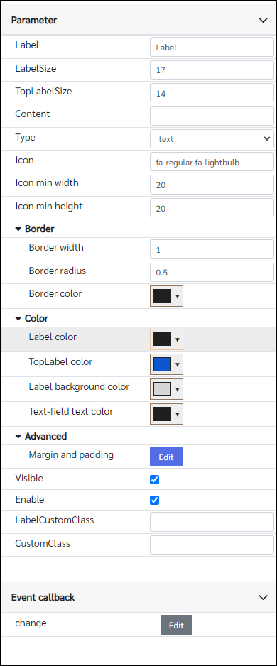
How does this component appears in Aimagin Connect?
What can be configured?

Parameters
Configuration Parameter |
Selectable Option/Value |
Description |
Default Value |
Data type |
Label |
|
Label text |
Label |
String |
LabelSize |
|
Text size of the label and the input field |
17 |
Number |
TopLabelSize |
|
Label text size when the editbox is in focus |
14 |
Number |
Content |
|
Editbox content |
|
String |
Type |
text--password--number |
editbox input type |
text |
String |
Icon |
|
Fontawesome icon class |
fa-regular fa-lightbulb |
String |
Icon min width |
|
Icon min width This may be useful to align more than one edit boxes together. Because all fontawesome icons do not have the same sizes. Therefore, giving min size will make it easy to align contents. |
20 |
Number (in pixels) |
Icon min height |
|
Icon min height This may be useful to align more than one edit boxes together. Because all fontawesome icons do not have the same sizes. Therefore, giving min size will make it easy to align contents. |
20 |
Number (in pixels) |
Border width |
|
Border width when it is not in focus, When it is in focus this will change to 3px |
1 |
Number (in pixels) |
Border radius |
|
Border radius |
0.5 |
Number (in rem) |
Border color |
|
Border color when it is not in focus mode |
rgb(31, 31, 31) |
Color |
Label color |
|
Label text color when it is not in focus |
rgb(31, 31, 31) |
Color |
TopLabel color |
|
Label text color when it is in focus. The same color will be applied to the border. |
rgb(11, 87, 208) |
Color |
Label background color |
|
Label background color needs to match the background color of the editbox |
rgb(255, 255, 255) |
Color |
Text-field text color |
|
Input field text color |
rgb(31, 31, 31) |
Color |
Margin and padding |
|
Margin & padding options for the component, icon and input field |
|
|
Visible |
true--false |
Show hide editbox |
true |
Boolean |
Enable |
true--false |
Enable disable editbox |
true |
Boolean |
LabelCustomClass |
|
Any externally defined classes can be assigned to the label from here |
|
String |
CustomClass |
|
Any externally defined classes can be assigned to the input field from here |
|
String |
Event callback
Event callback |
Description |
Change |
This callback will triggered if the input field has a changed |
When to use this component?
This can be used as an alternative to the default text field which is in the Components>Forms. In advance, this component have animation for the labels when the text field in focus. Therefore if any user wants this kind of component to be used with any web page can be used this editbox.
How does this component work?
This component works as a normal text field in addition to the animation actions on the label and the font awesome icon on the left. By default, there will be a callback for the input field to check whether the input field is in focus or not. If it is in focus the label will move up and allow the user to type anything in the text field.